概述
在之前的例子中,Scaffold 几乎随处可见,那么今天就来说一说它。
总结一下,Scaffold 是一个提供 Material Design 设计中基本布局的 widget,它可以帮助我们轻易的实现一个符合 Material Design 设计规范的页面。
官方示例:
import 'package:flutter/material.dart';
void main() => runApp(MyApp());
/// This Widget is the main application widget.
class MyApp extends StatelessWidget {
static const String _title = 'Flutter Code Sample';
@override
Widget build(BuildContext context) {
return MaterialApp(
title: _title,
home: MyStatefulWidget(),
);
}
}
class MyStatefulWidget extends StatefulWidget {
MyStatefulWidget({Key key}) : super(key: key);
@override
_MyStatefulWidgetState createState() => _MyStatefulWidgetState();
}
class _MyStatefulWidgetState extends State<MyStatefulWidget> {
int _count = 0;
Widget build(BuildContext context) {
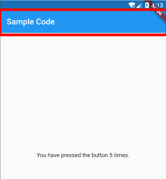
return Scaffold(
appBar: AppBar(
title: const Text('Sample Code'),
),
body: Center(child: Text('You have pressed the button $_count times.')),
floatingActionButton: FloatingActionButton(
onPressed: () => setState(() => _count++),
tooltip: 'Increment Counter',
child: const Icon(Icons.add),
),
);
}
}
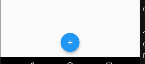
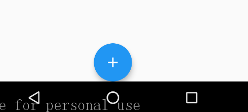
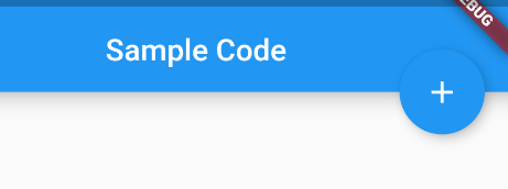
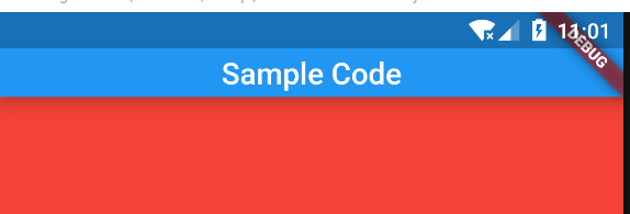
效果如下:

属性
看一下构造函数:
  const Scaffold({
    Key key,
    this.appBar,
    this.body,
    this.floatingActionButton,
    this.floatingActionButtonLocation,
    this.floatingActionButtonAnimator,
    this.persistentFooterButtons,
    this.drawer,
    this.endDrawer,
    this.bottomNavigationBar,
    this.bottomSheet,
    this.backgroundColor,
    this.resizeToAvoidBottomPadding,
    this.resizeToAvoidBottomInset,
    this.primary = true,
    this.drawerDragStartBehavior = DragStartBehavior.start,
    this.extendBody = false,
    this.drawerScrimColor,
  })
依次解释一下:
appBar
顶端栏,对应 Android 中的 Toolbar,如图:
我们通常会在 AppBar 当中添加一些页面信息以及图标,或者是弹出菜单的触发按钮,
AppBar 的常用属性:
- leading,在标题前面显示的一个控件,在首页通常显示应用的 logo;在其他界面通常显示为返回按钮。
- automaticallyImplyLeading,如果值为 true 且 leading 为 null,则自动尝试推断出 leading 小部件应该是什么。 如果值为 false 且 leading 为 null,则将标题 leading 空格。 如果 leading 小部件不为 null,则此参数无效。(感觉没啥意义)。
- title,
AppBar中主要内容,通常显示为当前界面的标题文字。 - actions,一个 Widget List,代表 AppBar 中所显示的菜单,对于常用的菜单,通常使用 IconButton 来表示;对于不常用的菜单通常使用 PopupMenuButton 来显示为三个点,点击后弹出二级菜单。
- flexibleSpace,一个显示在 AppBar 下方的控件,高度和 AppBar 高度一样,可以实现一些特殊的效果,该属性通常在 SliverAppBar 中使用。
- bottom,一个
AppBarBottomWidget对象,通常是一個TabBar。用来在 AppBar 标题下面显示一个 Tab 导航栏。 - elevation,标题栏的 Z 坐标(也就是标题栏的阴影效果,默认为 4)。
- shape,阴影设置。
- backgroundColor,标题栏背景色。
- brightness,Appbar 的亮度。
- iconTheme,Appbar 上图标的颜色、透明度、和尺寸信息。
- actionsIconTheme,Action 按钮的一些设置信息。
- textTheme,Appbar 上的文字样式。
- primary,Appbar 是否显示在任务栏顶部。
- centerTitle,标题是否居中显示,默认值根据不同的操作系统,显示方式不一样。
- titleSpacing,横轴上围绕 title 内容的间距 0.0 即占据所有有用空间。
- toolbarOpacity,应用程序栏的工具栏的透明程度。值1.0是完全不透明的,值0.0是完全透明的。
- bottomOpacity,Appbar 底部透明度,设置方式同 toolbarOpacity。
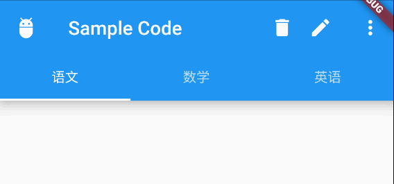
一个小例子:
      appBar: AppBar(
        leading: Icon(Icons.adb),
        title: const Text('Sample Code'),
        actions: <Widget>[
          Container(
            padding: EdgeInsets.only(right: 16),
            child: Icon(Icons.delete),
          ),
          Container(
            padding: EdgeInsets.only(right: 16),
            child: Icon(Icons.edit),
          ),
          PopupMenuButton(
              itemBuilder: (BuildContext context) {
                return <PopupMenuItem<String>>[
                  PopupMenuItem<String>(child: Text("热度"), value: "hot",),
                  PopupMenuItem<String>(child: Text("最新"), value: "new",),
                ];
              }
          ),
        ],
        bottom: TabBar(
          controller: _tabController,
          tabs: <Widget>[
            Tab(text: "语文"),
            Tab(text: "数学"),
            Tab(text: "英语"),
          ],
        ),
        elevation: 10,
        primary: true,
      ),
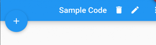
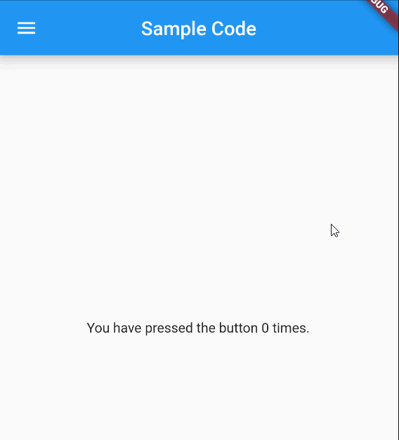
效果如下:
body
页面的主体部分,位于 AppBar 下方,通常是一个布局型的 Widget。
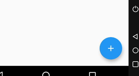
floatingActionButton
悬浮按钮, 一般位于屏幕右下角,Android 中也有类似的控件,其常用属性:
- child,按钮显示的内容,一般情况下是一个 Icon
- tooltip,长按时显示的提示
- foregroundColor,前景色,会对文字颜色产生影响
- backgroundColor,背景色
- focusColor,获得焦点时的颜色
- hoverColor,当指针悬停到按钮上面按钮的颜色
- heroTag,hero 效果使用的 tag,系统默认会给所有 FAB 使用同一个 tag,方便做动画效果
- elevation,未点击时的阴影
- focusElevation,获得焦点时的阴影
- hoverElevation,当指针悬停到按钮上面按钮的阴影
- highlightElevation,点击下阴影值
- disabledElevation,禁用按钮时的阴影
- onPressed,点击时触发的方法,如果该方法为 null,则按钮视为被禁用
- mini,FloatingActionButton 有
regular,mini,extended三种类型,默认为false即regular类型,true时按钮变小即mini类型,extended需要通过FloatingActionButton.extended()创建,可以定制显示内容 - shape,定义 FAB 的 shape,设置 shape 时,默认的 elevation 将会失效,默认为 CircleBorder
- clipBehavior,裁剪相关(暂时没发现有啥用,后期用到再补上)
- focusNode,焦点管理(暂时没发现有啥用,后期用到再补上)
- materialTapTargetSize,点击目标的最小范围(暂时没发现有啥用,后期用到再补上)
- isExtended,是否为
extended类型
其实最常用的也就是阴影和点击两个属性,其余的看看就行了。
floatingActionButtonLocation
用于设置 floatingActionButton显示的位置,有如下值可选:
endFloat
centerFloat
endDocked

centerDocked
startTop
miniStartTop(好像效果和 startTop 没啥区别)
endTop
floatingActionButtonAnimator
该选项用于将 floatingActionButton 过度到另外一个位置的动画效果。
persistentFooterButtons
在底部呈现一组按钮,显示于 bottomNavigationBar之上,body之下
drawer
左侧抽屉菜单,它是一个 Drawer 对象,看一下 Drawer 的常用属性:
- elevation,抽屉阴影
- child,抽屉布局
- semanticLabel,语义信息,和无障碍有关
例子:
      drawer: Drawer(
        elevation: 24,
        semanticLabel: "我的天啊",
        child: Container(
          child: Column(
            children: <Widget>[
              AppBar(
                leading: Icon(Icons.settings),
                title: Text("设置"),
              ),
              MaterialButton(
                child: Text("分类"),
              ),
              MaterialButton(
                child: Text("分类"),
              ),
              ),
            ],
          ),
        ),
      ),
效果如下:
endDrawer
右边的抽屉菜单,使用方式同上
bottomNavigationBar
显示在页面底部的导航栏。位于 persistentFooterButtons 之下
    floatingActionButtonLocation: FloatingActionButtonLocation.centerDocked,
    bottomNavigationBar: BottomAppBar(
        color: Colors.white,
        shape: CircularNotchedRectangle(), // 底部导航栏打一个圆形的洞
        child: Row(
          children: [
            IconButton(icon: Icon(Icons.home)),
            SizedBox(), //中间位置空出
            IconButton(icon: Icon(Icons.business)),
          ],
          mainAxisAlignment: MainAxisAlignment.spaceAround, //均分底部导航栏横向空间
        ),
      ),
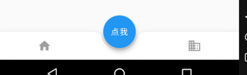
效果如下:
bottomSheet
底部弹出的 Widget,很少使用
backgroundColor
背景色
resizeToAvoidBottomPadding(已启用,改用 resizeToAvoidBottomInset)
类似于 Android 中的 android:windowSoftInputMode='adjustResize',控制界面内容 body 是否重新布局来避免底部被覆盖了,比如当键盘显示的时候,重新布局避免被键盘盖住内容。默认值为 true。
resizeToAvoidBottomInset
同上
primary
Scaffold 是否显示在页面的顶部
true:
false:
drawerDragStartBehavior
确定处理拖动开始行为的方式
extendBody
如果为 true,并且指定了 bottomNavigationBar 或 persistentFooterButtons,则 body 将延伸到 Scaffold 的底部,而不是仅延伸到 bottomNavigationBar 或 persistentFooterButtons 的顶部
drawerScrimColor
抽屉打开时用来遮盖主要内容的颜色
示例
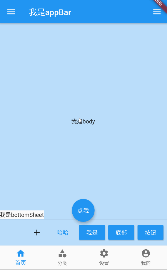
一个乱七八糟大集合:
import 'package:flutter/material.dart';

void main() => runApp(MyApp());

/// This Widget is the main application widget.
class MyApp extends StatelessWidget {
  static const String _title = 'Flutter Code Sample';

  @override
  Widget build(BuildContext context) {
    return MaterialApp(
      title: _title,
      home: MyStatefulWidget(),
    );
  }
}

class MyStatefulWidget extends StatefulWidget {
  MyStatefulWidget({Key key}) : super(key: key);

  @override
  _MyStatefulWidgetState createState() => _MyStatefulWidgetState();
}

class _MyStatefulWidgetState extends State<MyStatefulWidget>
    with SingleTickerProviderStateMixin {
  Widget build(BuildContext context) {
    return Scaffold(
      appBar: AppBar(
        title: Text('我是appBar'),
      ),
      body: Align(alignment: Alignment.center,child: Text('我是body'),),
      floatingActionButton: FloatingActionButton(child: Text('点我'),
        onPressed: () {},
      ),
      floatingActionButtonLocation: FloatingActionButtonLocation.centerDocked,
      // floatingActionButtonAnimator: ,
      persistentFooterButtons: [
        IconButton(icon:Icon(Icons.add),onPressed: () {},),
        FlatButton(child: Text('哈哈'),
          onPressed: () {},),
        RaisedButton(
          child: Text('我是',style: TextStyle(color: Colors.white),),
          onPressed: () {},
        ),
        RaisedButton(
          child: Text('底部',style: TextStyle(color: Colors.white),),
          onPressed: () {},
        ),
        RaisedButton(
          child: Text('按钮',style: TextStyle(color: Colors.white),),
          onPressed: () {},
        )
      ],
      drawer: Drawer(child: Align(alignment: Alignment.center,child: Text('我是drawer'),),),
      endDrawer: Drawer(child: Align(alignment: Alignment.center,child: Text('我是endDrawer'),),),
      bottomNavigationBar: BottomNavigationBar(
          type: BottomNavigationBarType.fixed,
          items: <BottomNavigationBarItem>[
            BottomNavigationBarItem(
                icon: Icon(Icons.home),
                title: Text('首页')
            ),
            BottomNavigationBarItem(
                icon: Icon(Icons.category),
                title: Text('分类')
            ),
            BottomNavigationBarItem(
                icon: Icon(Icons.settings),
                title: Text('设置')
            ),
            BottomNavigationBarItem(
                icon: Icon(Icons.account_circle),
                title: Text('我的')
            ),
          ]
      ),
      bottomSheet: Text('我是bottomSheet'),
      backgroundColor: Colors.blue[100],
      // resizeToAvoidBottomPadding: ,
      resizeToAvoidBottomInset: true,
      primary: true,
      // drawerDragStartBehavior: DragStartBehavior.start,
      // extendBody: false,
      drawerScrimColor: Colors.red[100],
    );
  }
}
效果如下: