CustomScrollView
概述
从名字上就可以看出,这个是“自定义滚动视图”,当我们需要对滚动制图做一些特殊定制的时候,就需要用到这个 Widtget 了,譬如页面的上半部分是 ListView 下半部分是 GridView、譬如可以折叠的 Appbar 等等。
假如我们的页面复杂,需要使用 GridView+ListView 来实现的话,就不能保证一致的滑动效果,因为它们的滚动效果是分离的,所以这时就需要一个"胶水",把这些彼此独立的可滚动 widget "粘"起来,而 CustomScrollView 的功能就相当于“胶水”。
构造函数
  const CustomScrollView({
    Key key,
    Axis scrollDirection = Axis.vertical,
    bool reverse = false,
    ScrollController controller,
    bool primary,
    ScrollPhysics physics,
    bool shrinkWrap = false,
    Key center,
    double anchor = 0.0,
    double cacheExtent,
    this.slivers = const <Widget>[],
    int semanticChildCount,
    DragStartBehavior dragStartBehavior = DragStartBehavior.start,
  })
scrollDirection,设置视图的滚动方向(默认垂直方向)
reverse,是否按照阅读方向相反的方向滑动,设置水平滚动时
设置水平滚动时
- 若
reverse: false时,则滚动内容头部和左侧对其, 那么滑动方向就是从左向右 - 若
reverse: true时,则滚动内容尾部和右侧对其, 那么滑动方向就是从右往左。
其实此属性本质上是决定可滚动
widget的初始滚动位置是在头还是尾,取false时,初始滚动位置在头,反之则在尾- 若
controller,接受一个
ScrollController对象,ScrollController的主要作用是控制滚动位置和监听滚动事件。ScrollController的主要作用是控制滚动位置和监听滚动事件。默认情况下,
widget中会有一个默认的PrimaryScrollController,如果子widget中的可滚动widget没有显式的指定controller并且primary属性值为true时(默认就为true),可滚动widget会使用这个默认的PrimaryScrollController这种机制带来的好处是父
widget可以控制子树中可滚动widget的滚动,例如,Scaffold使用这种机制在iOS中实现了"回到顶部"的手势primary,是否使用默认的 controller
physics,接受一个
ScrollPhysics对象,它决定可滚动Widget如何响应用户操作,比如用户滑动完抬起手指后,继续执行动画;或者滑动到边界时,如何显示。默认情况下,Flutter 会根据具体平台分别使用不同的
ScrollPhysics对象,应用不同的显示效果,如当滑动到边界时,继续拖动的话,在iOS上会出现弹性效果,而在Android上会出现微光效果。如果你想在所有平台下使用同一种效果,可以显式指定,Flutter SDK 中包含了两个
ScrollPhysics的子类可以直接使用:ClampingScrollPhysics:安卓下微光效果。BouncingScrollPhysics:iOS下弹性效果。
shrinkWrap,是否根据子 widget 的总长度来设置 CustomScrollView 的长度,默认值为 false
center,
anchor,
cacheExtent,设置预加载的区域
slivers,
Sliver家族 Widget 列表semanticChildCount,语义相关
dragStartBehavior
Sliver 家族
什么是 Sliver?
在 CustomScrollView 的构造函数中有一个 slivers 参数,它是一个 Widget 数组,但是这里的 widget 必须是 Sliver 类型的。
在 flutter 中,Sliver 通常指具有特定滚动效果的可滚动块,可滚动 widget,如 ListView、GridView 等都有对应的 Sliver 实现如 SliverList、SliverGrid 等。
对于大多数 Sliver 来说,它们和可滚动 Widget 最主要的区别是 Sliver 不会包含 Scrollable,也就是说 Sliver 本身不包含滚动交互模型。
正因如此,CustomScrollView 才可以将多个 Sliver "粘"在一起,这些 Sliver 共用 CustomScrollView 的 Scrollable,最终实现统一的滑动效果。
前面之所以说“大多数“ Sliver 都和可滚动 Widget 对应,是由于还有一些如 SliverPadding、SliverAppBar 等是和可滚动 Widget 无关的
它们主要是为了结合 CustomScrollView 一起使用,这是因为 CustomScrollView 的子 widget 必须都是Sliver
下面就讲一下这些 Sliver:
SliverAppBar
SliverAppBar 就是“Sliver 化”的 Appbar,区别在于 Appbar 是固定的,SliverAppBar 是可以跟随内容滚动的。
构造函数
  const SliverAppBar({
    Key key,
    this.leading,
    this.automaticallyImplyLeading = true,
    this.title,
    this.actions,
    this.flexibleSpace,
    this.bottom,
    this.elevation,
    this.forceElevated = false,
    this.backgroundColor,
    this.brightness,
    this.iconTheme,
    this.actionsIconTheme,
    this.textTheme,
    this.primary = true,
    this.centerTitle,
    this.titleSpacing = NavigationToolbar.kMiddleSpacing,
    this.expandedHeight,
    this.floating = false,
    this.pinned = false,
    this.snap = false,
    this.shape,
  })
- leading,导航栏左侧 widget
- automaticallyImplyLeading,如果 leading 为 null,是否自动实现默认的 leading 按钮
- title,导航栏标题
- actions,导航栏右侧按钮, 接受一个数组
- flexibleSpace,一个显示在 AppBar 下方的控件,高度和 AppBar 高度一样,可以实现一些特殊的效果,该属性通常在 SliverAppBar 中使用
- bottom,一个 AppBarBottomWidget 对象, 设置 TabBar
- elevation,控件的 z 坐标顺序,默认值为 4,对于可滚动的 SliverAppBar,当 SliverAppBar 和内容同级的时候,该值为 0,当内容滚动 SliverAppBar 变为 Toolbar 的时候,修改 elevation 的值
- forceElevated,
- backgroundColor,背景颜色,默认值为 ThemeData.primaryColor。改值通常和下面的三个属性一起使用
- brightness,状态栏的颜色, 黑白两种, 取值: Brightness.dark
- iconTheme,设置导航栏上图标的颜色、透明度、和尺寸信息
- actionsIconTheme,action 按钮图标的颜色、透明度、和尺寸信息
- textTheme,设置导航栏上文字样式
- primary,导航栏的内容是否显示在顶部, 状态栏的下面
- centerTitle,标题是否居中显示,默认值根据不同的操作系统,显示方式不一样
- titleSpacing,标题间距,如果希望title占用所有可用空间,请将此值设置为0.0
- expandedHeight,展开的最大高度
- floating,是否随着滑动隐藏标题
- pinned,是否固定在顶部
- snap,只跟 floating 相对应,如果为 true,floating 必须为 true,也就是向下滑动一点儿,整个大背景就会动画显示全部,网上滑动整个导航栏的内容就会消失
- shape,阴影设置。
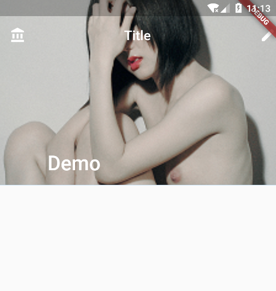
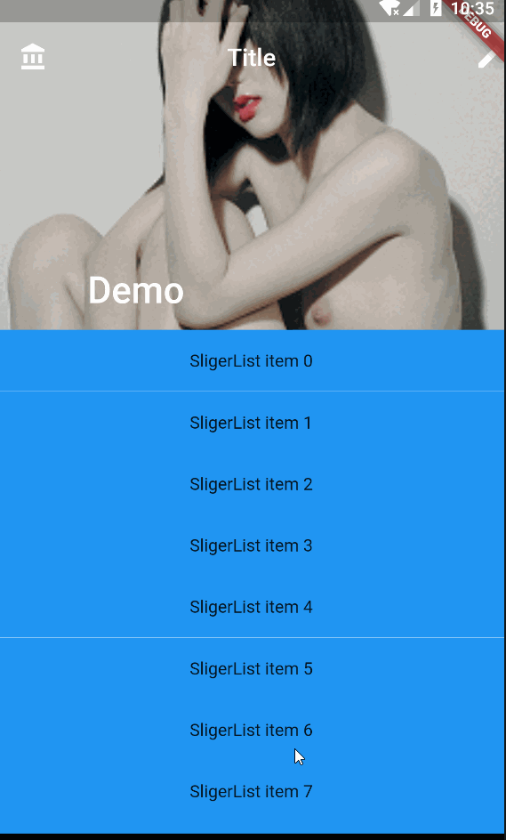
示例
          SliverAppBar(
            leading:Icon(Icons.account_balance),
            centerTitle: true,
            expandedHeight: 250.0,
            title: Text("Title"),
            actions: <Widget>[
              Icon(Icons.edit),
            ],
            flexibleSpace: FlexibleSpaceBar(
              title: const Text('Demo'),
              background: Image.asset(
                "assets/images/girl.png", fit: BoxFit.cover,),
            ),
          ),
如下所示:
SliverPersistentHeader
有点儿类似于 SliverAppBar,它可以根据滚动的距离缩小高度:
构造函数
  const SliverPersistentHeader({
    Key key,
    @required this.delegate,
    this.pinned = false,
    this.floating = false,
  })
- delegate,要展示的内容
- pinned,同 SliverAppBar
- floating,同 SliverAppBar
delegate 属性是一个 SliverPersistentHeaderDelegate 对象,它是一个抽象类,需要我们自己实现:
class DemoHeader extends SliverPersistentHeaderDelegate {
  @override
  Widget build(
      BuildContext context, double shrinkOffset, bool overlapsContent) {
    return Container(
      color: Colors.pink,
      alignment: Alignment.center,
      child: Text(
        '我是一个头部部件',
        style: TextStyle(color: Colors.white, fontSize: 30.0),
      ),
    );
  } // 头部展示内容

  @override
  double get maxExtent => 300.0; // 最大高度

  @override
  double get minExtent => 100.0; // 最小高度

  @override
  bool shouldRebuild(SliverPersistentHeaderDelegate oldDelegate) =>
      false; // 因为所有的内容都是固定的,所以不需要更新
}
示例
import "package:flutter/cupertino.dart";
import "package:flutter/material.dart";

void main() => runApp(new MyApp());

class MyApp extends StatelessWidget {
  @override
  Widget build(BuildContext context) {
    return MaterialApp(
      home: MyHomePage(),
    );
  }
}

class MyHomePage extends StatefulWidget {
  MyHomePage({
    Key key,
  }) : super(key: key);

  @override
  _MyHomePageState createState() => _MyHomePageState();
}

class _MyHomePageState extends State<MyHomePage> {
  List<String> data = [
    "1",
    "2",
    "3",
    "4",
    "5",
    "6",
    "7",
    "8",
    "9",
    "10",
    "11",
    "12",
    "13",
    "14",
    "15"
  ];

  @override
  Widget build(BuildContext context) {
    return Scaffold(
      body: CustomScrollView(
        slivers: <Widget>[
          SliverPersistentHeader(
            delegate: DemoHeader(),
            pinned: true,
            floating: false,
          ),
          SliverList(
            delegate: SliverChildListDelegate(
              data.map(
                (name) {
                  return new Container(
                    margin: EdgeInsets.fromLTRB(5, 2, 5, 2),
                    alignment: Alignment.center,
                    color: Colors.blue,
                    height: 50,
                    child: new Text(name),
                  );
                },
              ).toList(),
            ),
          ),
        ],
      ),
    );
  }
}

class DemoHeader extends SliverPersistentHeaderDelegate {
  @override
  Widget build(
      BuildContext context, double shrinkOffset, bool overlapsContent) {
    // 头部展示内容
    return Container(
      color: Colors.pink,
      alignment: Alignment.center,
      child: Image.asset("assets/images/girl.png"),
    );
  }

  // 最大高度
  @override
  double get maxExtent => 300.0;

  // 最小高度
  @override
  double get minExtent => 100.0;

  @override
  bool shouldRebuild(SliverPersistentHeaderDelegate oldDelegate) =>
      // 因为所有的内容都是固定的,所以不需要更新
      false;
}
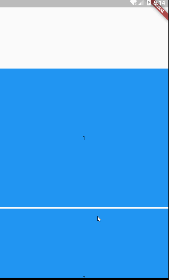
效果如下:
SliverList
"Sliver" 化的 ListView
构造函数
  const SliverList({
    Key key,
    @required SliverChildDelegate delegate,
  })
就一个 SliverChildDelegate 类型的参数,它是一个抽象类,有两种方法创建它的实现类:
SliverChildListDelegate
它适合需要展示数据较少的情况
构造函数:
  SliverChildListDelegate(
    this.children, {
    this.addAutomaticKeepAlives = true,
    this.addRepaintBoundaries = true,
    this.addSemanticIndexes = true,
    this.semanticIndexCallback = _kDefaultSemanticIndexCallback,
    this.semanticIndexOffset = 0,
  })
- children,必需,需要展示的数据列
- addAutomaticKeepAlives,非必需,见 ListView 相同属性
- addRepaintBoundaries,非必需,见 ListView 相同属性
- addSemanticIndexes,非必需,语义相关,暂不赘述
- semanticIndexCallback,非必需,语义相关,暂不赘述
- semanticIndexOffset,非必需,语义相关,暂不赘述
  List<String> data = [
    '1',    '2',    '3',    '4',    '5',    '6',    '7',    '8',    '9',    '10',   '11',    '12',   '13',    '14',    '15',  ];
          SliverList(
            delegate: SliverChildListDelegate(
              data.map(
                (name) {
                  return new Container(
                    margin: EdgeInsets.fromLTRB(5, 2, 5, 2),
                    alignment: Alignment.center,
                    color: Colors.blue,
                    height: 50,
                    child: new Text(name),
                  );
                },
              ).toList(),
            ),
          ),
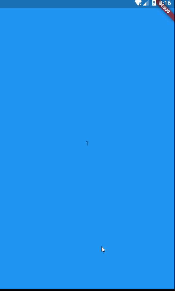
效果如下:
SliverChildBuilderDelegate
一般适合用来展示更多的列表,效率更高。
构造函数:
  const SliverChildBuilderDelegate(
    this.builder, {
    this.findChildIndexCallback,
    this.childCount,
    this.addAutomaticKeepAlives = true,
    this.addRepaintBoundaries = true,
    this.addSemanticIndexes = true,
    this.semanticIndexCallback = _kDefaultSemanticIndexCallback,
    this.semanticIndexOffset = 0,
  })
- builder,用来创建 ListView Item
- findChildIndexCallback,在重新排序的情况下,调用子项的 key 以查找子项的新索引。
- childCount,用来指定 Item 创建个数
- addAutomaticKeepAlives,非必需,见 ListView 相同属性
- addRepaintBoundaries,非必需,见 ListView 相同属性
- addSemanticIndexes,非必需,语义相关,暂不赘述
- semanticIndexCallback,非必需,语义相关,暂不赘述
- semanticIndexOffset,非必需,语义相关,暂不赘述
            delegate: SliverChildBuilderDelegate(
                  (BuildContext context, int index) {
                //创建子widget
                return new Container(
                  alignment: Alignment.center,
                  height: 50,
                  color: Colors.blue,
                  child: new Text('SligerList item $index'),
                );
              },
              childCount: 20,
            ),
效果如下:
SliverGrid
Sliver 化的 ListView
构造方法
  const SliverGrid({
    Key key,
    @required SliverChildDelegate delegate,
    @required this.gridDelegate,
  })
delegate 和 SliverList 一样,不赘述。
gridDelegate 就是控制 GridView 的列数的,它的类型是 SliverGridDelegate,这是一个抽象类,Flutter 提供了两个它的实现类供我们使用:
- SliverGridDelegateWithFixedCrossAxisCount
- SliverGridDelegateWithMaxCrossAxisExtent
具体示例看 GridView
除了构造方法,Flutter 还提供了两个方法来构建 SliverGrid:
- SliverGrid.count,参见 GridView 中的 使用 GridView.count 方法创建 GridView
- SliverGrid.extent,参见 GridView 中的 使用 GridView.extent 方法创建 GridView
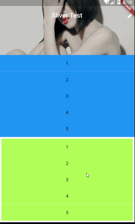
SliverPadding
就是个 SliverList 或者 SliverGrid 添加一层 padding
构造函数
  const SliverPadding({
    Key key,
    @required this.padding,
    Widget sliver,
  })
使用起来也很简单,padding 设置边距的值,sliver 设置需要添加边距的 Sliver 控件
示例
import "package:flutter/cupertino.dart";
import "package:flutter/material.dart";

void main() => runApp(new MyApp());

class MyApp extends StatelessWidget {
  @override
  Widget build(BuildContext context) {
    return MaterialApp(
      home: MyHomePage(),
    );
  }
}

class MyHomePage extends StatefulWidget {
  MyHomePage({
    Key key,
  }) : super(key: key);

  @override
  _MyHomePageState createState() => _MyHomePageState();
}

class _MyHomePageState extends State<MyHomePage> {
  List<String> data = [
    "1",
    "2",
    "3",
    "4",
    "5",
  ];

  @override
  Widget build(BuildContext context) {
    return Scaffold(
      body: CustomScrollView(
        slivers: <Widget>[
          SliverAppBar(
            title: Text("Sliver Test"),
            centerTitle: true,
            expandedHeight: 250.0,
            actions: <Widget>[
              Icon(Icons.edit),
            ],
            flexibleSpace: FlexibleSpaceBar(
              background: Image.asset(
                "assets/images/girl.png",
                fit: BoxFit.cover,
              ),
            ),
          ),
          SliverList(
            delegate: SliverChildListDelegate(
              data.map(
                (name) {
                  return new Container(
                    alignment: Alignment.center,
                    color: Colors.blue,
                    height: 50,
                    child: new Text(name),
                  );
                },
              ).toList(),
            ),
          ),
          SliverPadding(
            padding: EdgeInsets.fromLTRB(5, 5, 5, 5),
            sliver: SliverList(
              delegate: SliverChildListDelegate(
                data.map(
                      (name) {
                    return new Container(
                      alignment: Alignment.center,
                      color: Colors.lightGreenAccent,
                      height: 50,
                      child: new Text(name),
                    );
                  },
                ).toList(),
              ),
            ),
          ),
        ],
      ),
    );
  }
}
效果如下:
SliverFixedExtentList
和 SliverList 效果相同,只是多了一个 itemExtent 参数来设置 Item 的高度。
构造函数
  const SliverFixedExtentList({
    Key key,
    @required SliverChildDelegate delegate,
    @required this.itemExtent,
  })
- delegate,同 SliverList
- itemExtent,必填,用来设置 item 的高度
示例
      body: CustomScrollView(
        slivers: <Widget>[
          SliverAppBar(
            title: Text("Sliver Test"),
            centerTitle: true,
            expandedHeight: 250.0,
            actions: <Widget>[
              Icon(Icons.edit),
            ],
            flexibleSpace: FlexibleSpaceBar(
              background: Image.asset(
                "assets/images/girl.png",
                fit: BoxFit.cover,
              ),
            ),
          ),
          SliverFixedExtentList(
            itemExtent: 150,
            delegate: SliverChildListDelegate(
              data.map(
                (name) {
                  return new Container(
                    alignment: Alignment.center,
                    color: Colors.blue,
                    height: 500,//这里的 500 高度不起作用
                    child: new Text(name),
                  );
                },
              ).toList(),
            ),
          ),
        ],
      ),
效果如下:
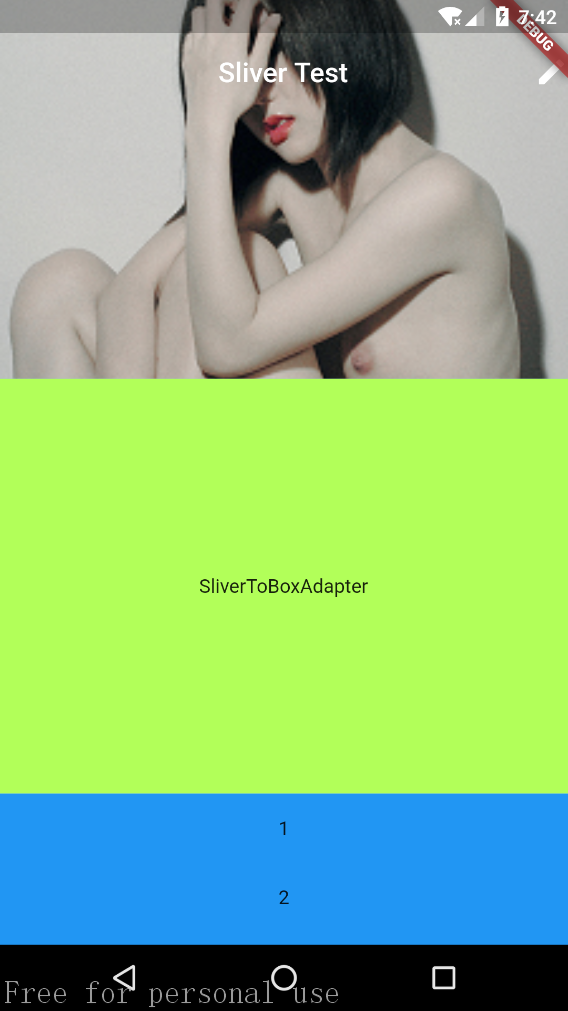
SliverToBoxAdapter
在 CustomScrollView 中只允许包含 “Sliver” 化的 Widget,该类就是将其他非 Sliver 化的 Widget Sliver 化。
构造函数
  const SliverToBoxAdapter({
    Key key,
    Widget child,
  })
只有一个 child 属性,将其他非 Sliver 的 Widget 传入即可。
示例
      body: CustomScrollView(
        slivers: <Widget>[
          SliverAppBar(
            title: Text("Sliver Test"),
            centerTitle: true,
            expandedHeight: 250.0,
            actions: <Widget>[
              Icon(Icons.edit),
            ],
            flexibleSpace: FlexibleSpaceBar(
              background: Image.asset(
                "assets/images/girl.png",
                fit: BoxFit.cover,
              ),
            ),
          ),
          SliverToBoxAdapter(
            child: Container(
              alignment: Alignment.center,
              height: 300,
              color: Colors.lightGreenAccent,
              child: Text("SliverToBoxAdapter"),
            ),
          ),
          SliverList(
            delegate: SliverChildListDelegate(
              data.map(
                (name) {
                  return new Container(
                    alignment: Alignment.center,
                    color: Colors.blue,
                    height: 50,
                    child: new Text(name),
                  );
                },
              ).toList(),
            ),
          ),
        ],
      ),
效果如下:
SliverFillViewport
当我们的 Item 高度大于(或者等于)屏幕高度时,可以使用 SliverFillViewport。
构造函数
const SliverFillViewport({
  Key key,
  @required SliverChildDelegate delegate,
  this.viewportFraction = 1.0,
})
delegate 和之前的一样,用于生成 item
viewportFraction 是每个 Item 高度对应屏幕高度的比例,如果是 1,则全屏,小于 1,则屏幕会显示 >1 个的 Item,大于 1 同理(这不废话么),但是需要注意的是,如果 item 的高度小于一个屏幕高度,在首尾会用空白 item 来把未填满的补上,就是首尾都会留空白,就不推荐使用这个 Widget 了。
示例
viewportFraction > 1
          SliverFillViewport(
            viewportFraction: 0.5,
            delegate: SliverChildListDelegate(
              data.map(
                (name) {
                  return Container(
                    margin: EdgeInsets.fromLTRB(0, 2, 0, 2),
                    alignment: Alignment.center,
                    color: Colors.blue,
                    child: Text(name),
                  );
                },
              ).toList(),
            ),
          ),
效果如下,注意首尾的白色填充:
viewportFraction < 1
          SliverFillViewport(
            viewportFraction: 1.5,
            delegate: SliverChildListDelegate(
              data.map(
                (name) {
                  return Container(
                    margin: EdgeInsets.fromLTRB(0, 2, 0, 2),
                    alignment: Alignment.center,
                    color: Colors.blue,
                    child: Text(name),
                  );
                },
              ).toList(),
            ),
          ),
效果如下:
viewportFraction = 1 略
SliverFillRemaining
这个 Widget 不知道该怎解释,上个 Widget SliverFillViewport 中 viewportFraction 参数设置不等于 1 的时候,首尾部分会用空白填充么,SliverFillRemaining 可以将空白填充部分填充为其他 Widget,一般是放在随后使用。
构造函数
  const SliverFillRemaining({
    Key key,
    Widget child,
    this.hasScrollBody = true,
  })
- child,填充空白的 Widget,不是必须 Sliver 的
- hasScrollBody,是否可以滚动,默认是 true,也就是说,除了填补空白区域,还会有一部分在屏幕外,可以通过滚动显示,如果为 false,则只是填补空白。
示例
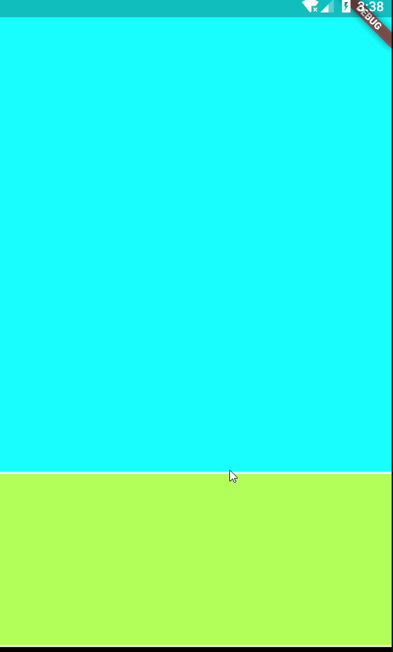
hasScrollBody = true
      body: CustomScrollView(
        slivers: <Widget>[
          SliverToBoxAdapter(
            child: Container(height: 500,color: Colors.cyanAccent,),
          ),
          SliverFillRemaining(
            hasScrollBody: true,
            child: Container(
              color: Colors.lightGreenAccent,
              margin: EdgeInsets.fromLTRB(0, 2, 0, 2),
            ),
          ),
        ],
      ),
效果如下:

hasScrollBody = false
      body: CustomScrollView(
        slivers: <Widget>[
          SliverToBoxAdapter(
            child: Container(height: 500,color: Colors.cyanAccent,),
          ),
          SliverFillRemaining(
            hasScrollBody: false,
            child: Container(
              color: Colors.lightGreenAccent,
              margin: EdgeInsets.fromLTRB(0, 2, 0, 2),
            ),
          ),
        ],
      ),
效果如下